i chose this picture because of the lines on the wall from the wood and the stripes on the zebra.
i chose this picture because of all of the lines in the background of the painting.
Shape - Shapes are formed wherever the ends of a continuous line meet. Geometric shapes such as circles, triangles or squares have perfect, uniform measurements and don't often appear in nature. Organic shapes are associated with things from the natural world, like plants and animals.
i chose this picture because of the cool and special shape of the flowers petals
i chose this painting because of all of the shapes that are in the clothes that the people are wearing.
Color - Color wheels show the primary colors, secondary colors, and the tertiary (intermediate) colors. They also show the relationships between complementary colors across from each other, such as blue and orange; and analogous (similar or related) colors next to each other such as yellow, green, and blue. Black and white may be thought of as colors but, in fact, they are not. White light is the presence of all color; black is the absence of reflected light and therefore the absence of color.
i chose this picture because of all of the really cool and bright colors in the petal of the flower
i chose this painting because of all of the different and bright colors that are used in it
Value (Tone) - Value, or tone, refers to dark and light; the value scale refers to black and white with all gradations of gray in between. Value contrasts help us to see and understand a two-dimensional work of art.
i chose this picture because of the shadows that are in the background
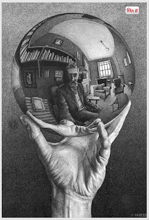
i chose this picture because of all of the cool shading in the sphere and the background
Form - Form describes objects that are three-dimensional, having length, width, and height.
i chose this picture because of the shape of the cube and because you can see the dimension
i chose this painting because of the definition that i can see from the shading that the used
Texture - Texture can be rough, bumpy, slick, scratchy, smooth, silky, soft, prickly--the list is endless. Texture refers to the surface quality, both simulated and actual, of artwork.
i chose this picture because of the way you can see the rough texture of the wood
i chose this painting because of the fluffy texture on the trees/head.
Space - Space refers to distances or areas around, between, or within components of a piece. Space can be positive (white or light) or negative (black or dark), open or closed,shallow or deep, and two-dimensional or three-dimensional.
i chose this picture because of all of the space around the soccer net
I picked this image because it looks symmetrical if folded in half
I choose this picture because the butterfly is symmetrical and looks well balanced.
Contrast- is created by using elements that conflict with one another. Often, contrast is created using complementary colors or extremely light and dark values. Contrast creates interest in a piece and often draws the eye to certain areas. It is used to make a painting look interesting.
I picked this image because the black and white are good contrasting
I choose this photo because it is really cool and interesting
I picked this photo because the eye viewer is focused on the man and the things around him
i chose this picture because the fish caches my attention
I choose this photo because you can tell they there is movement because of the blur in the background and the way the fur of the dog is.
I picked this photo because of its different shapes and lines and how it moves my eyes nicely.
I choose this image because it looks sort of like it repeats
I picked this picture because it has nice zig zag patterns
Rhythm- is the repetition of shapes, lines, and forms. Rhythm is a movement in which some elements recurs regularly. Like a dance, it will have a flow of objects that will seem to be like the beat of music.
I choose this image because the bottles are repetetive
i chose this picture because the people are repeating
I picked this image because it has all the same basic kinds of shapes
I choose this image because it has different lines and looks like its meant to be all together


.JPG)


No comments:
Post a Comment